
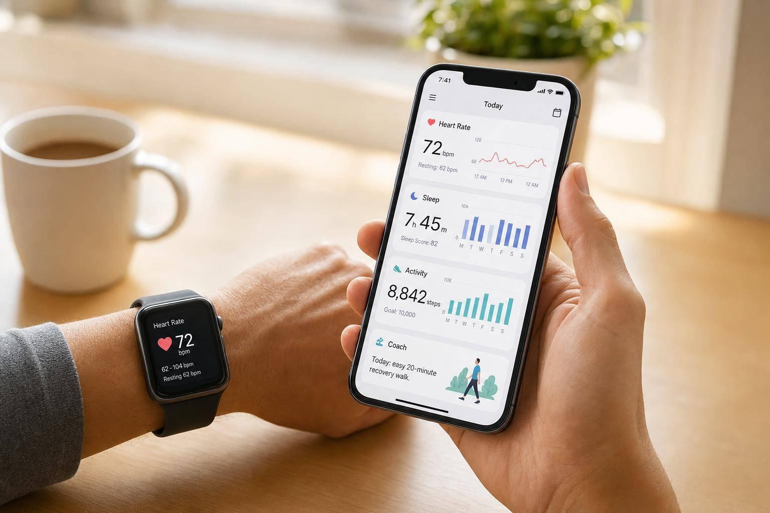
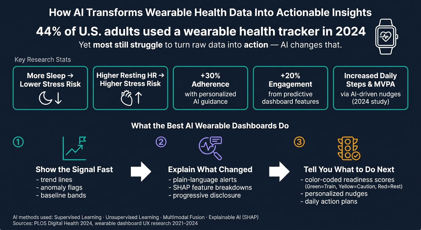
Wearables collect a lot of health data, but AI helps turn that data into answers. In 2024, 44% of U.S. adults used a wearable health tracker, yet most people still need help reading heart rate, sleep, stress, and recovery data in a way that leads to action.
Here’s the short version:
- AI finds patterns in heart rate, HRV, sleep, movement, and stress data
- Dashboards make those patterns easier to see with trend lines, baseline ranges, heatmaps, and alerts
- Explainable AI shows why an alert happened, often with plain-language notes and feature breakdowns
- Simple chart choices matter because people read line charts and bar charts faster than more complex visuals
- AI coaching turns charts into next steps, like whether to train, rest, or watch stress that day
What stood out to me is this: raw numbers rarely help on their own. A higher resting heart rate, lower HRV, or poor sleep score means little without context. AI adds that context by comparing your current data with your past patterns, combining signals into one view, and pointing to what changed.
A few facts from the research make the point clear:
- A 2024 study linked more sleep with lower stress risk
- Higher resting heart rate was tied to higher stress risk
- Personalized AI nudges increased daily steps and moderate-to-vigorous activity
- In some cases, tailored guidance improved adherence by up to 30%
- Predictive dashboard features lifted engagement by about 20%
I’d sum it up like this: AI makes wearable charts easier to read, easier to trust, and easier to act on. The best dashboards do three things well:
- Show the signal fast
- Explain what changed
- Tell you what to do next
That’s the main idea behind the full article below.
How AI Transforms Wearable Health Data Into Actionable Insights
How Does Machine Learning Interpret Wearable Sensor Data? - Emerging Tech Insider
sbb-itb-f5765c6
How AI turns wearable data into clearer visual patterns
Once AI finds the signal, the dashboard still has one more job: show it fast and clearly. People don’t want to stare at raw numbers and figure everything out on their own. AI-enhanced charts add baselines, flags, and short summaries so users can see what changed, what looks unusual, and what may need attention.[6]
How machine learning spots trends, anomalies, and daily patterns
Machine learning models learn what your normal pattern looks like, then point out changes from that baseline. That matters because small shifts can hide in plain sight. A 2024 PLOS Digital Health study found that first-year college students who got more sleep had lower stress risk, while higher resting heart rate was linked with higher stress risk.[3][4] In a plain chart, those signals can be easy to overlook. AI gives them context.
The way those findings appear on screen matters just as much as the model behind them. Smoothed trend lines with shaded baseline bands make it easier to spot whether HRV is drifting up or down over a period of weeks. Calendar heatmaps can make repeat patterns - like a rough Monday - jump out right away. Anomaly flags and short labels, such as "HRV below 30-day baseline", tell users what changed and why it matters.[6]
How multimodal fusion combines signals into one health view
AI can also pull several signals into one shared view instead of making users bounce between separate charts. Multimodal fusion combines heart rate, HRV, movement, sleep, and context in one place, which cuts down on chart switching.[5][6] A 2021 study showed this in practice: researchers mapped multiple sensor streams into a single visual embedding and found that it gave a more global view of daily behavior while still identifying activities accurately.[7]
On a dashboard, that can show up as a fused view with a composite recovery score and color-coded state transitions like rest, focus, exercise, and recovery, all based on combined signals.[5][6] But there’s a catch: if the screen gets cluttered, the value drops fast. The fusion works best when the display stays clean and easy to scan.
Table: AI methods, visual outputs, and example uses
| AI Method | Visual Output | Example Uses |
|---|---|---|
| Supervised learning | Risk scores, classification labels | Stress detection, sleep quality scoring |
| Unsupervised learning | Anomaly flags, outlier markers | Irregular HRV, unusual activity dips |
| Multimodal fusion | Unified dashboards, composite scores | Sleep + stress + recovery monitoring |
| Time-series-to-image | 2D maps, activity tiles, heatmaps | Activity recognition, daily pattern analysis |
| Explainable AI | Annotated charts, highlighted features | Alert explanations, trust-building for users |
What research says about explainable and user-centered dashboards
Once a dashboard is easy to read, the next step is simple: users need to understand why the model made its call. A stress alert only helps if people can see what triggered it. That’s where explainable AI comes in. Its job is to make model output easier to understand.[1][10]
How explainable AI makes model outputs easier to trust
SHAP breaks a prediction into feature-level contributions, so users can see which inputs pushed the risk score up or pulled it down.[1][10] Most often, this shows up as a ranked bar chart or a force plot.[12]
Research points to a hybrid setup. SHAP handles the attribution, and the dashboard layers on a plain-language summary that tells users what it means in everyday terms.[8][14] In practice, that means showing the short explanation first, then letting people open the deeper detail if they want it. This progressive disclosure approach helps keep the screen clear without hiding the logic behind the alert.[12][14]
How dashboard design affects how quickly people understand data
The chart itself matters more than people sometimes think. In one wearable-dashboard study, simple bar plots and line-plus-scatter charts were the easiest to read. Radar charts, by contrast, took more time and were more likely to be misread.[9] That tracks with other studies of AI tools for health management, where bar graphs led to the fastest comparisons.[15]
Some chart types also fit certain data better than others:
- Stacked bar charts worked well for showing how time was divided across sleep, sedentary time, and activity.[9]
- Box plots gave a compact summary of weekly variability in measures like heart rate or sleep duration.[9]
The main lesson from human-centered design research is pretty direct: cut clutter, keep scales consistent, and save bright colors for alerts that need attention right away.[9][13][11]
Once users understand the signal, the dashboard can move from explanation to action. This transition often involves AI-driven nudges that prompt users toward healthier behaviors based on their data.
Table: Which chart types work best for which users
| Chart Type | Best Data Type | Primary Users | Key Benefit |
|---|---|---|---|
| Line-plus-scatter | Time-series (heart rate, steps, HRV) | Clinicians and consumers | Trends and anomalies visible at a glance |
| Simple bar chart | Discrete comparisons (daily scores, weekly averages) | Clinicians and consumers | Fast group comparison; easy to explain |
| Stacked bar chart | Categorical time allocation (sleep, activity, sedentary) | Clinicians and consumers | Quick balance check across days |
| Box plot | Distributions and variability (weekly BP, sleep duration) | Clinicians | Compact outlier and spread summary |
| Radar chart | Multi-dimensional profiles (stress, fitness, sleep, recovery) | Consumers | Multi-metric overview - use sparingly |
| SHAP bar/force plot | Feature attribution (risk drivers) | Clinicians and consumers | Transparent model reasoning |
How AI-powered coaching uses visualization to drive action
Once a chart is easy to read, coaching needs to answer the next thing on a user's mind: What should I do today? The best AI coaching dashboards do that well. They turn wearable data into daily priorities instead of filling the screen with pretty but passive graphs. That's the shift that turns visualization into coaching.
The goal isn't another chart. It's a decision. When a dashboard combines heart rate variability, sleep quality, and recent activity into one color-coded readiness score - green = train, yellow = caution, red = rest - it gives users a next move right away.[16][18] AI can also adjust that dashboard based on the user's current risk level and goals, which makes the guidance personal instead of one-size-fits-all.[17][19][20]
Research backs this move from insight to action. A 2024 study found that syncing wearable data with AI-driven personalized nudges increased daily step counts and moderate-to-vigorous physical activity over several weeks.[18] In some cases, guidance shaped around a person's own data patterns improved adherence by up to 30%.[19] Predictive analytics in chronic disease dashboards can also increase engagement by about 20%.[17]
Behavior change research points to a similar pattern. Daily prompts, real-time feedback, progress tracking, and personalized feedback are linked with sustained adherence and long-term habit formation.[20][22] And when wearable data is connected with meals, alcohol, or stress logs, users can spot patterns they can actually do something about.[18][20][21]
A practical app can bring all of this into one daily view. Healify, for example, turns wearable, biometric, bloodwork, and lifestyle data into a daily action plan through its AI coach, Anna.
Table: Dashboard features, AI capabilities, and user outcomes
| Dashboard Feature | AI Capability | User Outcome |
|---|---|---|
| Daily health score (sleep, heart rate variability, activity) | Multisensor data fusion and prediction | Faster decisions; lower cognitive load |
| Color-coded readiness indicator | Classification and risk scoring | Clearer sense of when to push vs. recover |
| Trend timeline (steps, heart rate, sleep) | Pattern detection | Better self-awareness of habit impact |
| Personalized alerts and nudges | Just-in-time adaptive intervention | Higher adherence; timely behavior prompts |
| Progress rings | Personalization and feedback | Sustained motivation; habit consistency |
| Plain-language coaching summaries | Explainable AI | Easier to trust and act on AI guidance |
| Stress and sleep guidance | Physiological signal analysis and prediction | Better stress and sleep behaviors |
Conclusion: What AI adds to wearable data visualization
Put all of these studies together, and the pattern is pretty clear: AI makes wearable data easier to read, easier to trust, and easier to use. Across the research, four gains show up again and again: unified multisensor views, automatic pattern detection, explainable alerts, and personalized action prompts.
AI can pull multiple wearable signals into composite scores that are much easier to understand at a glance[2][25][28]. It can also spot trends and anomalies on its own, so users can see what changed without digging through raw charts or logs[2][24]. On top of that, explainable AI methods such as SHAP help open up black-box model decisions by showing why a risk alert fired or why a readiness score dropped[1][10][27]. And AI coaching apps can turn those visuals into personalized next steps instead of leaving people with data and no direction[23][26][29].
The harder part now is the tradeoff between accuracy, interpretability, and real-time performance on battery-powered devices. That tradeoff matters because a visualization only helps if it stays fast, clear, and usable in daily life. The best wearable dashboards don’t just display data. They help people make real-time health adjustments.
FAQs
How does AI know what’s normal for me?
AI figures out what’s normal for you by building a personalized baseline instead of leaning on broad averages. That usually happens over an initial 2–4 week period.
During that time, it watches your patterns, including resting heart rate, sleep, and activity. It also accounts for the way life naturally shifts, like weekday vs. weekend routines and even seasonal changes.
As your habits and fitness change, that baseline changes too. The goal is simple: spot real anomalies more accurately and cut down on false alarms.
Why are simple charts better for wearable data?
Simple charts make wearable data easier to understand because they keep the signal-to-noise ratio high. That means the health patterns that matter most stand out fast instead of getting buried.
Complex visuals often do the opposite. Extra gridlines, random color choices, and other clutter can make useful insights harder to spot. Healify cuts through that mess by turning your data into an easy-to-read dashboard and a personalized action plan.
Can AI coaching really improve daily habits?
Yes. AI coaching can help improve daily habits by turning complex health data into practical, personal action steps.
It looks at metrics like heart rate, sleep, and activity, then suggests specific changes that match your lifestyle and goals. Healify’s AI coach, Anna, helps turn that data into clear, useful guidance.